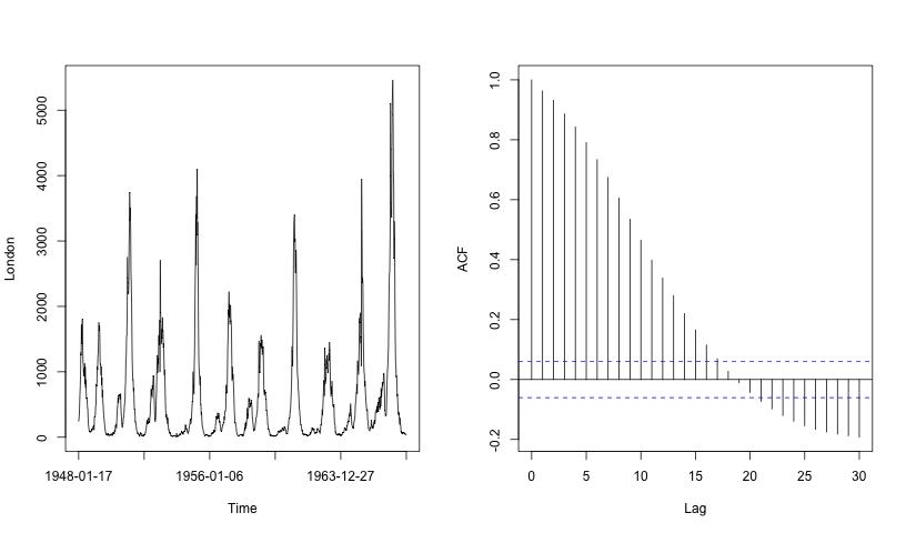
Measles Autocorrelation
The left plot in the figure above is the first half of the London measles time series from above (the black time series in the plot of seven city's measles cases). The strongly periodic behaviour can be clearly seen. The right-hand plot shows the empirical autocorrelation (the correlogram).
The autocorrelation at lag zero is always one. This is because a series is always perfectly correlated with itself. At lag one the autocorrelation value is 0.963 which is close to one, which means that measles cases at a given week are very similar to the next week (either before or after). Indeed, the autocorrelation at lag two is 0.932, so values of the measles time series two weeks apart are very similar. Indeed, all autocorrelations up to lag six are greater than 0.7, indicating high linear association up to six weeks apart. A different picture emerges when looks at two instants of time separated by a larger number of weeks. The autocorrelation taken 26 weeks apart is -0.166. This indicates that the number of measles cases six months apart are dissimilar. This kind of autocorrelation shows that the disease ebbs and flows on an approximate six-monthly time period. One can extend the autocorrelation to higher lags and one can see that a 104 week period shows a high autocorrelation of 0.495, indicating a strong biennial period for this data.
We now look at the autocorrelation of the FTSE time series.
FTSE Autocorrelation...
|