Spectrum
The autocorrelation plot is not the only tool that we can use to spot periodicities in a time series. The spectrum plot gives information about how power (or variance) in a series is distributed according to frequency.
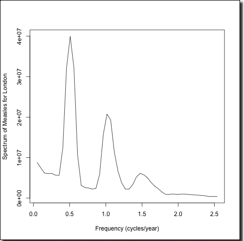
Figure left: London Measles Spectrum.
The figure left shows the spectrum plot obtained from the first half of the London measles time series. The largest peak occurs at the frequency of 0.5 cycles/year, which corresponds to one cycle every two years or a biennial oscillation. There is also a large peak corresponding to annual oscillation and also a slightly smaller one at three cycles per two years.
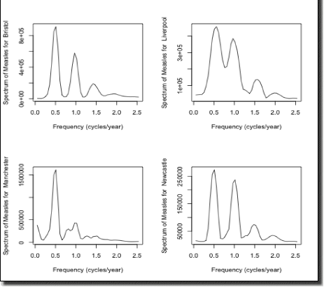
Indeed, the spectrum plot can be produced for the other cities. Below we have produced it for Bristol, Liverpool, Manchester and Newcastle and interesting differences emerge. Bristol appears fairly similar to London, whereas the biennial peak seems to smaller relative to the annual peak for Liverpool and Newcastle compared to London and the biennial peak for Manchester seems more pronounced.
|